Saturday, December 22, 2012

Press: Article in the News Advertiser

I couldn't ask for a better gift this year...


This past November, a new artist friend of mine (Allan O'Marra) offered to write an article about me in the local paper. Here's the link: http://www.durhamregion.com/what's%20on/article/1551328--making-a-go-of-an-art-career

The article is also published in the December 21, 2012 issue of the News Advertiser for Ajax, Ontario. And I'd like to take this opportunity to thank everyone who has supported me and I look forward to great things in 2013.

Saturday, November 24, 2012

New Website

So I finally uploaded my new website. However, it is still very compact with only a handful of my recent work. I need to work on an expanded design to accomodate additional content for 2013, especially once my classes get going.

Check out www.crystalbrownart.com and stay tuned for more updates!

Monday, July 16, 2012

Sunday On The Porch


Just wanted to thank everyone who stopped by Silverstone Gallery yesterday where I displayed some of my work. I was hoping for a sunny day, but got the complete opposite :( I haven't seen it rain that hard in a long time. But still some people did come by and I'm happy to do it again in September.

At least I wasn't struck by lightning, it was quite the light show yesterday...

As always, check Twitter @crystalbrownart for updates on upcoming events and works in progress.

Tuesday, May 1, 2012


Intro to Classical Drawing will be my first workshop in Ajax, Ontario and I'm really excited about it! I'll be teaching some basic (but extremely valuable) drawing skills. You don't need experience, just willingness to learn. This workshop will be great for those who want to refine their drawing abilities or are just starting out and need some tools to help them draw more accurately.

Check out http://www.crystalbrownart.com/2012/05/workshops-2012.html for more information.

Monday, April 23, 2012

Auction for Shelter From The Storm


I am pleased to donate all proceeds of this painting to Shelter From The Storm, an organization supporting abused Canadian women and their children.


 Click Here for more on Shelter From The Storm.

Wednesday, January 18, 2012

@crystalbrownart

I'm finally on Twitter as of today, which feels strange but hopefully it's a good thing. I'll be updating the goings-on in my artistic life on there, please follow me @crystalbrownart! Happy Tweeting :)

Foray Into Digital

Happy New Year! I'm going to try to make this a happy one at least. I've started doing digital painting recently and it's got my creativity going again, especially since I'm not relying on reality that much, it's mostly imaginative (for now). That kind of puts me in the mood to tackle traditional painting again. Here's what I've been up to:

"Green and Blue Day", 2012

"Sunset", 2012


Thursday, June 30, 2011

Still-Life With a Tea Pot (June 30, 2011)

"Separated" (In progress, detail), Oil on Canvas, 2011

I've finally settled on a title for this painting. The concept was in place from the beginning but I was searching for a title that would be the most explanatory without being too obvious. Don't mind the lighting, the tea pot is not painted as light in person. Things are moving along and I'm about halfway finished. The hardest parts are the metal container and just turning those edges on the tea pot, which I haven't done yet. The only object that's basically done is the metal lid, everything else needs more layers and revision. So far so good though...


Sunday, June 19, 2011

OAA Annual Juried Art Show (Thursday, June 16th, 2011)

"Laura Horseman" (2011) and "Ruins" (2011, Honourable Mention)

I've participated in this annual juried show for a few years and it's gotten better and better. The work was truly exceptional and I was lucky to be apart of it. I really wouldn't want to judge that collection of work! My recent still life drawing received an Honourable Mention, which is always nice. There are still a couple of competitions I want to enter this year so I better get cracking!

I just became a member of the Portrait Society of Canada, and I'm planning a portrait painting to enter into their annual competition later this year.

Friday, May 27, 2011

Still-Life With a Tea Pot

Here's the first layer of paint for my latest still-life (detail). You can see the dead colour layer as well. I feel myself making a lot of progress with technique, and that's really making this much more enjoyable than previous paintings.

Thursday, April 14, 2011

Still-Life Drawing: Finished! (April 14, 2011)

(click to enlarge for better quality)
It's done! I am getting this photographed tomorrow so hopefully that goes well. I prefer taking photos in daylight so maybe tomorrow morning I'll post a better picture. As you can see I'm preparing my board for travel and there better not be any smudges when I take the board out tomorrow, lol, or I'm going to cry!

Wednesday, April 6, 2011

Still-Life Drawing: Stage 2 (April 6, 2011)

I'm racing to get this done by the end of the month and being new to using white chalk so extensively in a drawing, I'm a little worried. But I'm actually having lots of fun! There's nothing like creating light with white chalk on tinted paper. It's feeling very intuitive right now, which is great. No wonder so many artists love this process!

Saturday, April 2, 2011

Still-Life Drawing: Stage 1 (April 2, 2011)

I just started this today but I've been planning it for awhile. I broke a beautiful container a couple years ago that I was previously thinking about using in a painting. The funny thing is I was more inspired to use it after I accidentally broke it. It looked much more intriguing and I had a great opportunity to do something conceptual with it.

Once I set up the broken pieces, they reminded me of ancient ruins and they have a beauty that didn't exist when the container was intact. So that's what I'll call this drawing; "Ruins".

It will be on tinted paper but I want to incorporate white chalk, which is why I didn't start straight on the "good paper". I'll be using white chalk a little more than I'm used to and I don't know how it'll turn out. That's why its good for me to have a cartoon or blueprint (if you will) so if anything goes terribly wrong, I don't have to start from scratch.

I'm still a little unsure about the composition. I'll take another look at it tomorrow but I might just end up moving one of those little broken pieces around...

Tuesday, March 29, 2011

Drawing In Progress: Finished!

Laura Horseman, Graphite on Tinted Paper, 9.5"x12", 2011

She's finally finished and I'm so glad! I've also decided to add my new signature, which is the monogram I already use for my stationery. I think it's much better than my old signature, it's much more polished. Thanks for following and sorry about the graphite glare.


Thursday, January 6, 2011

Inspiring Imagery from the Entertainment Industry


Just last year I was enjoying the music one of my favourite bands, Sade, when I noticed how incredibly beautiful their album cover was. The album is Soldier Of Love (2010) and on the cover is the lead singer Helen Folasade Adu and I could have swore this was a painting. I was immediately trying to think of who could have painted it and thinking I wish I did it myself! To me it’s clearly influenced by painting but it turns out it’s a photograph/Photoshop as usual. I think it’s interesting that it’s not the usual photograph with the band’s name on it and there is an attempt to evoke a very sophisticated painterly quality. There are numerous other artistic album covers but this one grabbed me because it looks to me like a contemporary realist painting.

Then yesterday I came across this movie poster for The Other Woman (2010) starring Natalie Portman and there she is but, again, not in the usual way. Are illustrators making a comeback in the movie poster business? It could have been the usual photo collage with the title on it but this appears to be a hybrid of a hand drawing with digital elements with the intent to appear mostly as a drawing. I think it’s really well done and it got me thinking that these types of images in entertainment could be helping contemporary realism right now. Granted it’s not painting but it’s a shift from just photos and text back to art. And again, there were always the occasional artsy posters but this one is clearly influenced by contemporary realist art.

I'm not sure this is a trend but I hope it is.

Tuesday, November 30, 2010

"Intensity" vs. "Chroma" and Understanding Munsell

Ever since I found Rational Painting a couple years ago, I've been puzzled by Munsell. There's a colour wheel and that's about all I could recognize about it. As you know, most kids in art classes are given the colour theory of the Impressionists and that's the first thing that comes to mind when I think about my early colour theory education—Monet, Seurat...If you could use colour theory to create works like them then you fully grasped colour. That's what I learned and that was fine because there wasn't anything else, at least not what my teachers knew about.

Looking back to my early attempts at mixing “intensity scales” and monochromatic scales...all sorts of scales, I realize they didn't really help, not when it came to painting what was in front of me because the standard mixtures were not sufficient, they were too arbitrary. I quickly realized that not all pigments fit into these pigeon holes and the colour wheel stopped working and became this mysterious thing I felt I needed magical powers to make work for me.

Painting became something I could do one day and not the next. I could never mix the same colour on the fly one day and get again the next day and I accepted that as part of what painting is. That's why drawing was always better for me; value is value, there's no confusion there. I thought “Why can't paint do that?” When I found this site and saw these strange Munsell notations, it went straight over my head. I heard the term “chroma” before and it sounded familiar to me, then I saw people using it synonymously with “intensity” and I relaxed again because I know about Hue, Value and Intensity. Then I found that actually didn't help me understand chroma at all.

Intensity seemed to block my understanding of chroma. I read some people saying it's the same as chroma, some people saying they are completely different. I figured artists disagree frequently and that's all that is, but after attempting a self-portrait and trying to mix my skin tone day after day, I had to get to the bottom of this issue. I knew Munsell had to solve this problem but I couldn't grasp it if I couldn't grasp chroma. Intensity and Chroma could not exist together in my mind and reading this excerpt from A Colour Notation by A.H. Munsell, I finally understood why.

“Intensity is a misleading term, if chroma be intended, for it depends on the relative light of spectral hues. It is a degree rather than a quantity, as appears in the expressions, “intense heat, light, sound”--intensity of stimulus and reaction...The word becomes especially unfit when used to describe two very different phases of a colour—as its intense illumination, where the chroma is greatly weakened, and the strongest chroma which is found in a much lower value.”

That's like fresh air rushing to my lungs. How did I survive without this hundred-year-old information for so long? It really is unbelievable. Now I can actually start learning and using Munsell.

Ahh, that's better.

Monday, November 29, 2010

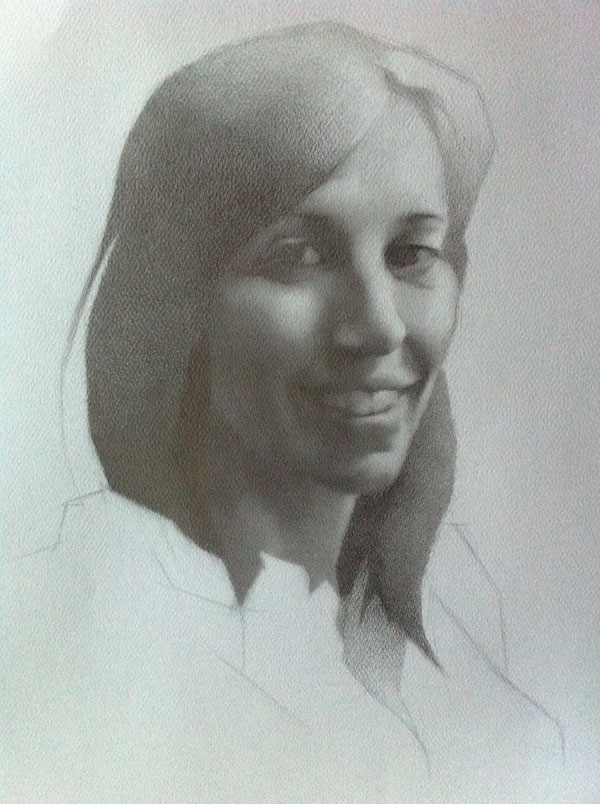
Drawing In Progress: My Friend Part 7

Here's a truer representation of the drawing. Compare that to last week's iPhone photo...this one is so much better! I worked on the hair shapes a bit more. I forgot how time consuming dark areas are to shade in and even-out. The teeth are better (I really hate dental work in drawings, it's very challenging). The eyes are still ambiguous, I still need more information to fill them in more. Overall I feel much better about it than I did last week but I think this may be my last drawing in graphite...

Monday, November 22, 2010

Drawing In Progress: My Friend Part 6

So this paper is a huge problem (I knew it would be). It's not so much an issue in person but getting a good photo of it is a nightmare. The graphite glare on the raised areas of the paper are really distracting. It just gets worse in the darker areas, the light areas are fine.

Anyway, I've done a bit more but I'll have to figure out whether or not I can selvage this drawing based on the paper. It's something to do anyway, keeps my mind off the pain I'm in sometimes which is great for not having to take pain killers.


Tuesday, November 9, 2010

My Website Is Down

I was just informed that my website (crystalcbrown.com) isn't working so I'm in the process of either fixing it or dropping it all together. Right now my host is asking that I pay extra to fix whatever happened and I'm not happy about that, it doesn't make sense. So if this doesn't get resolved I'll be looking for a new host. Sorry for the inconvenience if you've tried to check out my website lately.

Update*: I'm back in business! Everything should be up and running now. PHEEWW!